Dev Diary 41
Hi hacknplanners,
It’s been a while! I hope you can forgive us for the long time of silence, this year is not being easy for anyone and we are no exception. I sincerely wish you and your loved ones are safe and healthy, and that your businesses are not extremely affected by the whole COVID situation.
Today we are presenting an update focused on the UI of our web application. We have been getting a lot of feedback since our last major interface update, both from who have been working with us for a long time and from who left us for another service, and we detected plenty of things to improve. There are 4 main aspects of the user interface of an application like HacknPlan that are key: readability, intuitiveness, usability, and performance. Today, we are focusing on the first two, but we plan to keep working extensively on the UI in the last quarter of the year, especially on performance. I’m sure there are many new features and tools you’ve been waiting for, but there are a lot of small things that, all together, can mean a lot in the day to day operations of your teams. Small UI/UX things that convert the process of documenting and tracking your progress from an annoyance to an enjoyable task.
But don’t worry, nothing has drastically changed. Most stuff is in the same place (except for a few things we’ll mention later), and we focused mostly on giving a refresh to the design, making it a bit flatter and simpler, letting it breathe, and trying to make important things stand out among the dense pages of information.
Are you ready? Let’s get into the details!
General design
- We removed most borders of the panels and sections of the application and went for a flat design. Panels, buttons, and other elements have a smooth shadow to stand out from the background.
- In the old UI, it was sometimes difficult to determine if some text was a button, just text, a link, and element that can be dragged… because they didn’t have borders. That’s now fixed.
- We removed the header of the application to give more vertical space to the sections. Some of the icons were moved to a small menu on the right of the screen (avatar, notifications, search…), and the main navigation dropdown was moved to the top of the left menu.
- We added an “autocollapse” function to the left menu that can be activated and deactivated using the pin icon at the bottom. This automatically collapses the menu after any navigation action, this way you always have the maximum available space for the content. We plan to make it manually resizable in a future release, sadly it didn’t make it to this one.
- We changed the default font of the application from Helvetica to Noto Sans. However, we made the font configurable! You can go back to Helvetica if you want, or choose between Noto Sans, Roboto and Lato. You can also choose among 3 font sizes, Normal (default), Big or Small. This configuration is available under Settings -> Application (right below the theme selection panel). Playing with the font type, size, and browser zoom you can achieve interesting results if you find the default UI too big or small.
- When you open the notifications panel, the ones that haven’t been read yet are marked with a New label.
- We improved the project creation dialog, with a better and more visual workspace and project type selection stages. We hope with this improvement more people realize there are many feature and module configurations you can choose for your project, going from a very basic and lightweight kanban board to a fully-featured project management suite, covering the needs of different team sizes, workflows and styles.
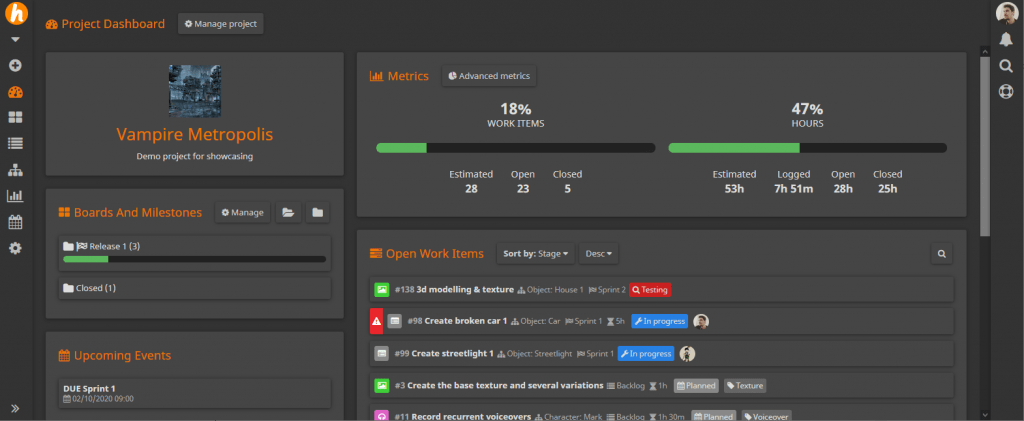
- Even though we really loved them, we replaced all circular progress bars in metrics sections with horizontal linear bars. The only reason is they took to much vertical space and we wanted to make more data available at a glance.
Kanban and work items
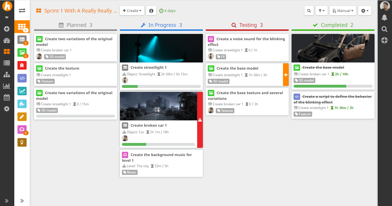
The kanban board and the work item cards are where you will appreciate more changes, as they are one of the most important parts of HacknPlan.
UPDATE: We received a lot of feedback about the default card category labels that came with the UI update. They were meant to make it easier to spot items based on their category, but many people complained about the readability (too much color and text). We reverted the change and made the previous category title the default one, and added the possibility of configuring the category display for free uses too. You can now choose from the regular text, an icon with color, a label, a color band or not displaying it at all. We also rolled back the position of user avatars on the card.
- First of all, all the features regarding categories are now available to free users, including the edition of category icons and colors, the collapsible category panel, colored categories on cards, card configuration…
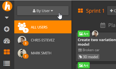
- We introduced a new kanban “sub-board” mode: boards by user. Using a button on top of the left menu of the kanban and backlog sections (or pressing Y on your keyboard), you can switch between category and user sub-boards. You can now easily visualize the tasks a specific team member is working on and forget about creating a long list of specific filters.
- We reviewed the design of the work item cards in order to maximize the readability of the data and make it easier to spot what you’re looking for:
- A very important piece of information that should stand out from a card is the importance level, important cards can be easily spotted now with a label and icon on the right border of the card.
- Besides the normal position at the bottom of the card, we introduced a new display mode for board pictures, available for premium users. This mode renders the picture as a header for the card with a fixed height, taking less vertical space but still giving context and color to the card.
- Another interesting feature is you can now middle-click on card pictures and open them on a viewer, navigating through all the attached pictures of the item with the viewer buttons or the arrow keys. This feature has been made with artists in mind, allowing them to take a look at all the visual content of an item without opening the editor.
- We introduced a new optional display mode for categories, which is a label on the left side of the card, including color and icon. If you want your cards to truly be recognizable by their category, this option is for you.
- The board status popup (previously board info) now contains not only a great board overview but also all the information on the milestone the board belongs to. You can now take a look at milestone metrics, information… without leaving the kanban board.
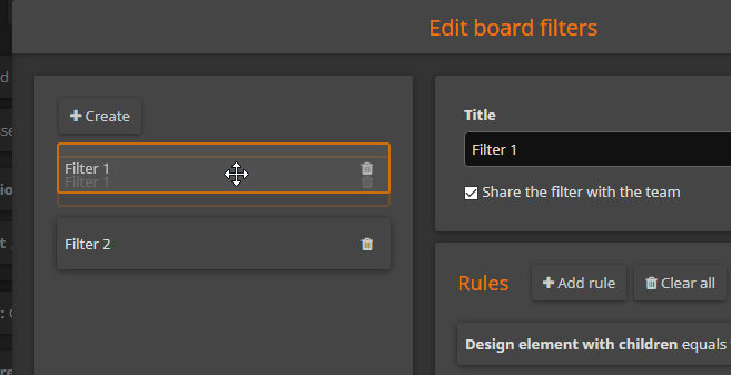
- Board filters are manually sortable using drag and drop now, this way you’ll have full control of how they are displayed on the filter dropdown.
- The Show story tasks option is now under the Filters dropdown, don’t miss it!
- For premium users, the backlog is now displayed grouped by design element too, when this feature is enabled, giving you a high level and design-based view of the backlog items. The grouped by design element mode of the kanban boards has been improved too, with Expand/collapse all buttons and a more intuitive design.
- You can navigate through the kanban and backlog items using the arrow keys. More keyboard improvements for cards will come in future updates, such as multiselection, sending to the top, bottom, next or previous stage…
Other improvements
- You can now add multiple users to your project or workspace in one single operation, entering all the email addresses or usernames in different lines. This will make setting things up a lot easier for big teams.
Bug fixes
- Alignment issues for Markdown tables.
- Shared filters weren’t properly shared with users added to the project after they were created.
- Start date of the work item not updated by the API.
- Category names overlapped the kanban menu in some browser and viewport size combinations.
- The Send to board dialog was not prefilled with the default board (when the item is not in it).
- Fixed issue with clicks on context menu opening items behind it in Firefox.
I hope you can appreciate the work we put into this, and even though we know UI updates of tools we use regularly are a disruption somehow, after some time getting used to the changes we truly believe readability and intuitiveness have improved and are a good foundation for the next round of updates that will focus on usability (discoverability of actions, reduce the steps to perform common operations…) and performance (reduce loading and rendering times of big projects, GDMs, Gantt charts…). We also don’t forget about our roadmap, there are many interesting features there that we will work on too, like v1.0 of the API, the WYSIWYG editor, etc.
See you soon, stay safe, and happy planning!