Dev Diary 45
Hi hacknplanners,
We are back with an important and long-awaited update, we have been receiving a lot of feedback from you and prepared a new release that focuses on UI/UX. Our main goal was to make the user interface cleaner, sharper, and more intuitive, and reduce clicks to perform common operations. We also included some other small improvements we hope you like.
Let’s get into the details!
Redesigned user interface
We have focused on the design of the whole application, making use of a new color palette for better readability (got rid of the orange titles, yay!), giving objects a bit more space to breathe and making it more pleasant to the eye. We believe now is easier to locate the information you are looking for.
We have also worked on making the most important bits of information stand out. Additionally, we have reduced the number of clicks needed to perform certain actions, which will be discussed in the following points.
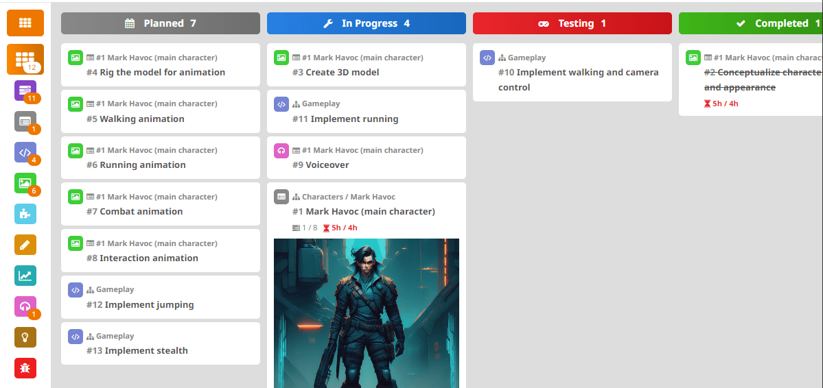
Kanban board
For those of you using Personal Plus or Studio tiers, we have implemented multiselection drag & drop in this update. It is now possible to select several work items at the same time and move them together. This is something that you have requested a lot and we believe it can be very useful when it comes to reorganizing work items on the board or backlog.
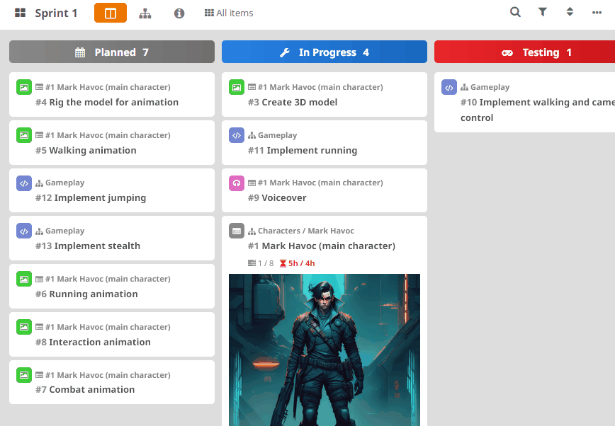
When it comes to work item cards, we added a quick floating menu of the work item on mouseover. This way, it is possible to perform certain frequently used actions (log work, add assignees, send to another board or design element, clone and delete) in a faster way, reducing clicks. Note that the context menu on right-click still works as usual, with additional options.
Note: If the floating menu is not your cup of tea and click on it accidentally, you can always disable it by clicking on the ellipsis icon on the top-right corner of the kanban board, Edit card display options, and then Display floating menu: No.
We also added a new section in the Kanban board for metrics and details, that you can quickly access by clicking on the info icon on the board header.
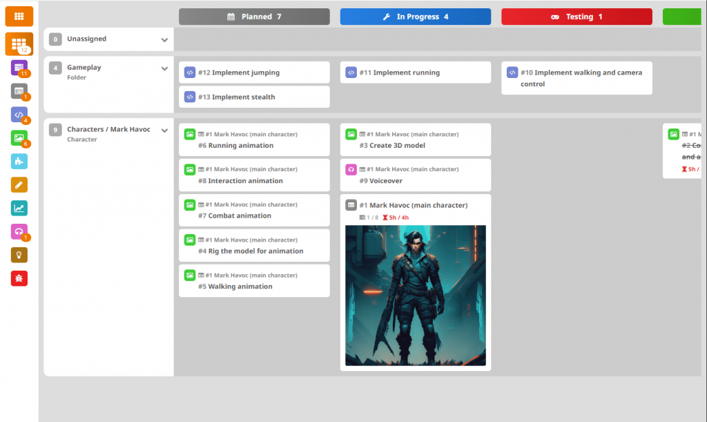
In this update we have redesigned the grouped view by design element (available to Personal Plus and Studio users), it is now more readable, with collapsible lanes for each design element. This view is now available with just one click, by pressing the design element icon on the board header.
Note: We plan to include a view just like this for user stories in the near future.
We also worked on the performance of the Kanban board, which suffered as the number of contained items grew. We have reduced loading and rendering times, making them faster.
Design Model tree view
You can now easily expand or collapse the design elements by middle-clicking anywhere on the element. This is intended to improve usability, as it is much easier to do this without having to click on the arrow button on the right, or the child count on the left.
A floating menu has been added to the design elements, similar to the one for work item cards, which appears when the mouse is over the element. This allows certain actions to be performed quickly and with fewer clicks (such as adding a child element or adding a work item, among others).
Work item /design element panel
The view of the work item/design element panel is one of the parts of the application we gave more love to in this update. The main purpose was to make it more intuitive, reduce clicks for common operations, and make it more readable.
First of all, forget about all these dropdowns with actions to modify the work item or design element. You can now modify any property of the item with just one click, write or select the new value and press enter. You can even create elements on the spot. For instance, you can just click on the Board property, write a new board name, enter, and the board will be created and your work item sent to it.
Unlike before, now all work item/element properties are shown every time you open it, so you can visualize or modify it right away. However, if you like minimalistic work items and there are properties you never use (like dates, or estimations…), remember you can disable them from Administration -> Modules.
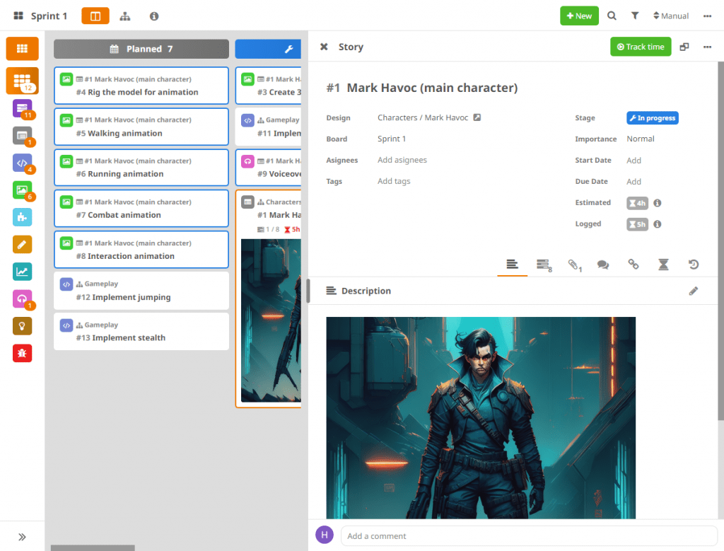
For the rest of the sections of the work item/design element panel (description, comments, subtasks…), we have implemented 2 visualization modes, that you can switch by clicking on the button on the work item/design element panel header, next to the ellipsis icon:
-
Tab (default): Each section will be displayed as a tab. Use this option if you prefer a simpler view without seeing everything at the same time, so you can focus more, and you don’t want to scroll a lot.
-
Single page: All the sections will be displayed on a single page, sequentially, as it was before. Use this option if you prefer to have everything at hand the whole time.
One important detail is we made work items on the design element panel sortable using drag and drop, so you can now reorganize them properly. We also improved the drag-and-drop sorting for the user story tasks, making it more reliable.
Last but not least, we have added a quick comment text box at the end of the work item. This will appear regardless of the view you have selected for the work item and will allow you to include comments without having to go to the corresponding section, thus gaining agility when documenting the work item.
Work item creation
For this update, we have added an option to quickly create multiple work items in one operation (Studio only). When you are creating a work item, click on the Batch button on the header. Then, you just can enter or paste a list of titles, one per line, and one work item per title will be created with the same properties.
We have redesigned the form to make it easier to modify using the keyboard. It is now sequential, so it doesn’t overwhelm that much when you have too many fields. Also, it has been designed following the same structure and design as the work item panel to make everything more intuitive. The Edit fields dropdown is still in place, allowing you to configure which fields you want to see during work item creation.
We hope you like the new look n feel of HacknPlan! This is the first update of a series of improvements we are working on for this year, we’ll hit you with fresh news very soon. If you have any questions or want to share your feedback, please answer below or send us an email.
Happy planning!