A fresh look for HacknPlan
Dear hacknplanners,
Today, we are happy to share an update that is not about a single module, but about the product as a whole. HacknPlan recently entered its second decade, and it felt like the right moment to refresh the way it looks, feels, and presents itself.
We have introduced a new branding and logo, and also launched a new website that better reflects where HacknPlan is going. The new site is cleaner, faster, easier to read, and comes with improved documentation to help both new and existing users find what they need more quickly.
This is more than a cosmetic change. It is the beginning of a new era for HacknPlan, one where we want the product identity, the website, and the application experience to feel more aligned as we continue the transition toward v2.
Let's take a look!
A new brand for a new stage
HacknPlan has grown a lot since its first release. Over the years, we expanded the platform, added many new features, and learned a lot from your feedback. As we move into the next 10 years of the product, we wanted the brand to evolve too.
The new branding gives HacknPlan a more modern and distinctive identity, and the new logo follows the same direction. The goal was not to change for the sake of changing, but to create a visual language that better represents the platform today and the direction we are taking with v2.
Alongside that, we rebuilt the website to make it more modern, faster, and easier to navigate. Pages are more readable, the content is better organized, and the documentation experience is much improved. Whether you are discovering HacknPlan for the first time or looking up a specific feature, the experience should now feel much smoother.
HacknPlan v1, refreshed
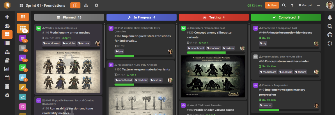
Even while HacknPlan v2 continues to grow, we did not want the existing experience to stay behind. HacknPlan v1 received a visual refresh to bring it closer to the new branding and the look and feel of the v2 modules, closing the gap and making both versions feel more cohesive.
We revisited colors, contrast, spacing, and visual weight across the interface. Fields, buttons, and text are now easier to read, with better contrast overall. We also removed some borders to reduce clutter and give the UI a cleaner, lighter feel.
Dark mode has also been refined. It is now a bit darker, with stronger contrast and a more modern appearance, closer to what users expect from the dark themes of current tools.
These changes are subtle in isolation, but together they make the day-to-day experience cleaner, more readable, and more consistent. And, most important, we didn't made any significant changes in the layout, position or behavior of the page (except the Gantt Chart), so you won't be disrupted by this change.
UX and performance improvements
This update is not only about visuals for v1. We also spent time improving usability and speed in some of the areas that matter the most in daily work. While you wait for the v2 version of these modules, you'll enjoy a better experience:
Gantt chart improvements
The new Gantt Chart v2 is coming, but we wanted to make the current version much better in the meantime. The v1 Gantt chart has been vastly improved in performance, making it feel much faster and more responsive. Navigation is smoother, and general usability has been refined to make working with large plans less cumbersome.
Kanban panel performance
We also improved the performance of the Kanban panel, especially for boards with many items. Loading is faster, scrolling feels smoother, and overall interaction is more fluid in large boards.
Game Design Model keyboard navigation
The Game Design Model now has basic keyboard navigation, making it easier to move through large structures without relying entirely on the mouse.
- Up and down arrow keys move through the list
- Left and right arrow keys collapse and expand elements
This is a small but important first step toward a more keyboard-friendly experience across the application, which will be enhanced, among other things, in the the Game Design Model v2 (currently under development and expected to see the light soon).
Faster v2 modules
On the v2 side, we also made several performance improvements behind the scenes, and the v2 modules now load faster. As we keep migrating more parts of HacknPlan to the new architecture, this kind of optimization is a major priority for us.
Documents bug fixes
We also fixed a couple of issues in the Documents module:
- Selecting several blocks and converting them to a list only added the last one
- The broken link action in the selected text bubble menu
Thank you to everyone who reported these issues and helped us track them down.
This update marks the start of a broader refresh for HacknPlan. A new brand, a new website, a cleaner v1 experience, and better performance across the board are all part of the same goal: making HacknPlan feel faster, clearer, and more cohesive as we move into the next chapter.
There is still a lot more to come, especially on the v2 front, and we are excited to keep sharing that progress with you in the coming months.
Happy planning!