Hi hacknplanners,
After so much hard work, sweat and tears, the major update of HacknPlan is finally out! We are so happy to see it live and also expectant to see how you guys receive it. We are aware that this update introduces so many structural changes and you may feel a bit lost or overwhelmed at first. However, we truly believe once you get used to it, you are going to love how the new interface and features improve your productivity and your overall user experience.
This is the first and most breaking of a series of releases that will add all the improvements we announced back in the day, which will come out during the next months in smaller updates. You can review all the changes included in this update here:
Release change log
For those very used to the old interface who feel a bit lost, these are some tips that will help you find the section or action you are looking for:
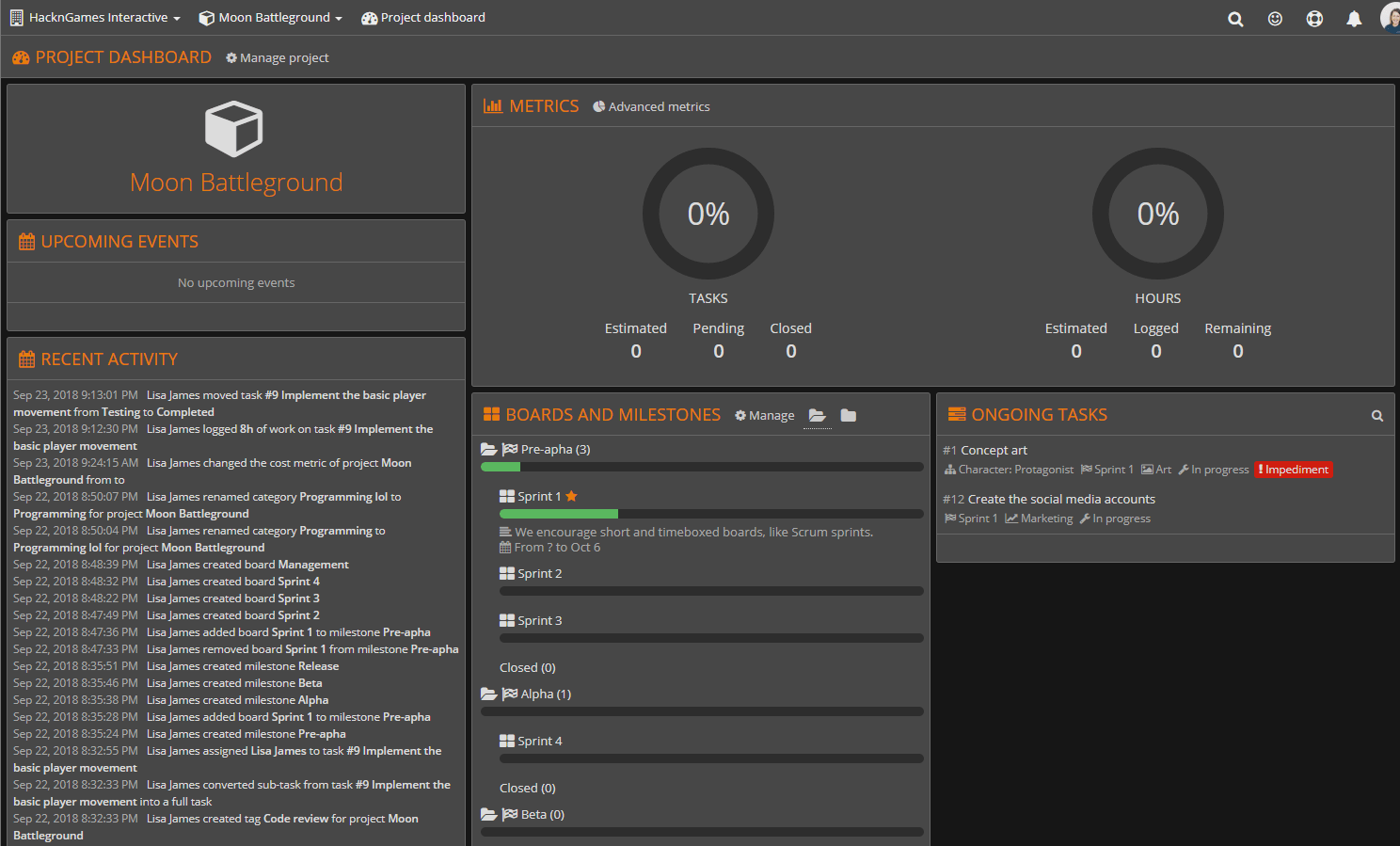
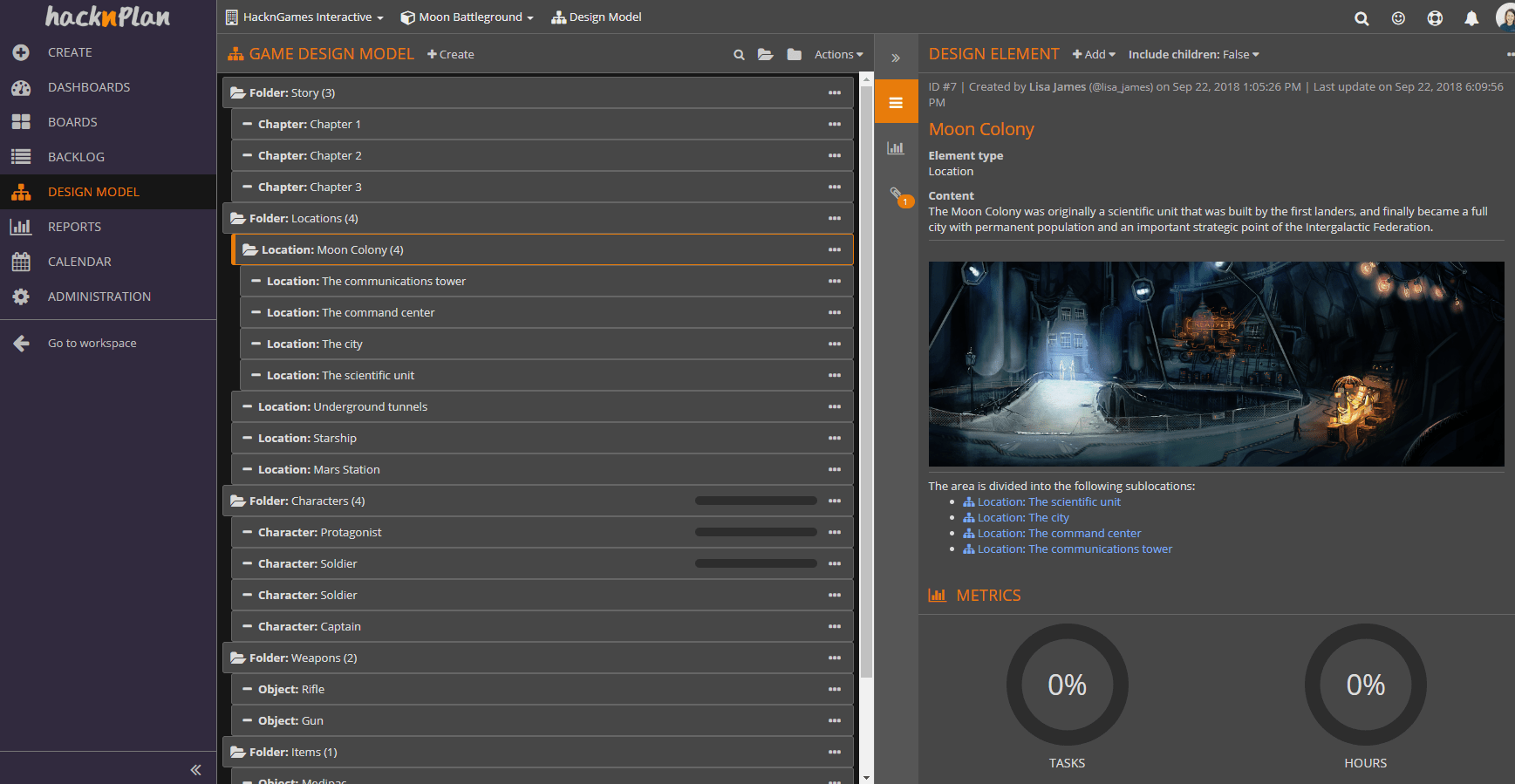
- What we used to call Milestones, are now called Boards, so they are kanban boards with optional start and due dates. Additionally, there are Milestones which are entities you can use to group Boards under a bigger goal for a better and more comprehensive organization of your roadmap.
- What we used to call Organization (an entity which contains projects, such as your personal one or the ones created by Studio subscriptions) are now called Workspaces.
- Everything is accessible through the left menu directly, so all the sections of your project or workspace are there. The workspace and project dropdowns on the header are mostly the same.
- All the admin actions, such as modifying the basic information of the project, manage boards and milestones, add users and edit their permissions… have been moved to the Administration section of the project, instead of being spread over the whole application. This way management is simpler and the other sections are cleaner and faster. Also, it’s more intuitive for new users to find them this way.
- The Summary section and the special ones included in Studio (Project, Milestone and Team) have been rebuilt as dashboards and you can find under the Dashboard section on the left menu. You also have My Dashboard, which gives you an overview of your own work in the context of the project, board or milestone.
Despite all the visual changes and the reorganization of sections, everything keeps working the same: your kanban boards, your tasks, your design elements… Once you get used to the new UI, I’m sure you’ll love it! Not to mention the new features such as the tag system, one of the most requested features in HacknPlan history.
Besides the update, we are working on the documentation so it reflects all the new changes and will add more details which are not very well covered. You can expect it to be updated during the next few days. Also, we will be alert in order to quickly fix any bug or issue you find; we tested this deeply but with an update this big you never know. Please report anything you find so we can take care of it quickly.
Finally, please let us know what you think of the update after you have time to play with it, we designed this using a bunch of feedback we collected from you in the course of the last few years so we want to know how well we did it. We know is impossible to make everyone happy and many of you liked the application as it was, but we believe these changes will be better for most of you guys in the long run. Please share your thoughts here, on Twitter, Facebook or Reddit, we’ll be happy to hear about them.
Happy planning!
Excellent update guys! Well done!
Glad you like it!
I’m guessing there’s no way to go back to the old UI?
A big part of why I used hacknplan over similiar websites was due to how comfortable I found the layout as it was. I’m finding the new layout to be much more visually cluttered.
No, I’m afraid there is no turning back. What do you think is cluttered exactly? Maybe the task edition panel? Most of the sections show more or less the same information, they are just reorganized. The only part that I think can display more information at once it the task and milestone edition panels now that they display everything in a single page instead of having tabs. Is that it?
It might just be initial impressions. A big thing that is niggling at me is the way that cards have all their information in a single vertical stack, previously stuff like comments was off to the side right? I think I did prefer the tab method as well even though it’s probably a lot less clicky to actually get to all that information.
Some subtle stuff seemed unnecessary, I’m noticing a lot of text (such as task numbers, subheadings like “element type”) don’t have a distinct colour anymore (like a lot of it was previously orange and is now grey on the dark theme), making important information stand out a lot less.
I’m not keen on the way milestones were reworked to be folders containing separate boards. Functionally it’s not too different (I really liked switching between them with the dropdown), it’s more of a perception thing. I feel like my team might mistake separate boards as concurrent sets of tasks when really I’m using them to define milestones (finish one before moving on).
It’s a shame the changes are so drastic and that we can’t turn it back as a personal setting. On the positive side the tags should be nice for categorising tasks, I always hated having to lock a task into area A or area B when realistically a lot of tasks I make cross into multiple areas of work. Good job.
I understand the change is big, but keeping both interfaces would have been a bit of a burden on this update because it would have required all the new features to be implemented in both versions. Anyway, we are always open to your criticism, and if there are things that people don’t like we will work on them, the application and the UI will keep evolving (not that drastically, but little by little) so I’m sure we will fix any issue remains there after some adaptation time. Thanks for your sharing your thoughts.
By the way, take a look at the Administration -> Modules section, maybe there are any features there you don’t use you can disable, that hides them from the UI.
Don’t get me wrong, I love hacknplan so much, and use it for all of my projects, but I really wish there was a way to go back to the old ui. I don’t understand why most of the important fields like ‘cost’ and ‘sub-tasks’ are disabled by default, but then if I enable them in modules, they are then mandatory fields. So there’s no inbetween like befrore, where the fields were open and easily accessible, and you could also chose not to input data into them. Sorry to say it but this patch was a major downgrade in my opinion. Feel like the software is 10 times harder to use. The reason I started loving it in the first place was because of it’s ease of use, it gave me less task-planning time, thus more development time 🙁
I’m sorry you are feeling this is a downgrade, but there is an in-between, you can store which are the visible fields by default on a task without making them mandatory. When you are creating the task and added your desired fields, checking the Remember fields option will make them the default after saving the task. Sorry if this was not intuitive to you, maybe we should add it to modules too. The problem before is many people used to get overwhelmed by the many fields on task creation, so we wanted to make it progressive. We understand it is a big change and there is an adaptation time, but we believe the application is more productive now once you get used to it.
Just wanted to say that, although jarring (I didn’t actually realize there was a UI update coming) I like the new update. I’m not used to it yet, but it now looks much more like a professional app and a lot less like someone’s side project. I do hope you either bring back some of the colors that were used to highlight important info, or perhaps (eventually) give us the ability to choose custom colors in the Options or something. I like the Milestones switch, I can now keep track of multiple boards for a deadline instead of having to keep track of which boards are for the upcoming version.
As for me not knowing about the incoming update, it’s partly my fault for not checking the main website, but I also don’t see anywhere in the app itself that would show any News or anything like that (Or an email newsletter with that info). Maybe either have them pop up in our Notifications or add an extra one for “App News” or something.
Anyway, great work! I’m already enjoying the new UI 😀
Glad to see you like it! What are the colors you are missing? We sent several newsletters about the update, maybe you chose not to receive them when registered?
Sorry I think I must’ve explained it poorly. I meant upon creating a task, I find it annoying that I have to add each field I’d like to keep track of, because I use the same fields for pretty much every task I create, so it feels like a lot of unnecessary clicking. I think it feels like more of a problem for me personally because I like to break everything into very small tasks in my game development, rather than making big tasks with lots of sub-tasks. I appreciate the communication and I really appreciate the work that’s gone into the software. I can understand that an update is never going to please all of your user base, so I just wanted to say thanks for the hard work, and giving us such a helpful tool.
Hi Noah, I don’t know if I fully understand what you mean. You want to define which fields are added by default to the task when you are on the creation dialog, so you don’t have to click on the Fields dropdown to enable them every time, is that it? As I said, if you click Remember fields on the footer of the task creation dialog and create that task, those fields you added manually will become the new default, so they will be there every time you create a task and you don’t have to add them manually anymore. Isn’t that what you are missing?
Ahhh I see. Sorry, my misunderstanding. Found this quite confusing to find initially, so thought it wasn’t a possibility. Thanks for the quick reply.
No problem, we can see that is not as intuitive as we thought it was, so we will think how can make it better.
I went into my settings and turned on the Newsletter ? Some sort of little in-app notification could still be nice, though.
I see the options for changing Tag colors & icons. It would be nice if the Color box changed color as we selected, I have to keep clicking off of it to see the Icon box for the color change. Categories are all grey though, and in Dark Mode it’s a lot of grey text on a grey background for the boards. It’s not horrible, but I think it could be tweaked with a little color. Usability is great, it’s just a cosmetic quirk for me.
Hi Chris,
In a previous blog entry, you mentioned adding user stories to HNP’s capabilities; any idea as to when those changes will roll out?
Also, a minor pain point to mention here: it would be a nicer user experience if the Notifications and Sections sidebars would collapse automatically when clicking or mousing away from them instead of having to find the X or arrows to collapse them. Often find them getting in the way.
Anyway–nice update! Still adjusting to things as they’ve moved around, but enjoying the new additions. Thanks!
Oh, and by “Sections sidebar”, I mean the sidebar with Dashboards, Boards, Backlog, GDM, etc.
Hi Joe,
Yes, the user story feature was planned for this update, but it was finally postponed to simplify the delivery of the most breaking changes. We plan to release the rest of the features that are on our roadmap in shorter, more frequent updates (monthly at least). Not sure when will exactly be released, but it will be high in the backlog.
About what you say about closing the panels automatically, I agree, that is something we plan to add, at least for the notifications and the search. The menu is trickier, because depending on what you’re doing, it may be an inconvenient that is collapsing all the time. I guess we could make it configurable so you can choose. As a side note, I don’t know if you know about it, but both the left menu and the search and notification panels can be open/expanded or closed/collapsed using the keyboard: M for the menu, F for search and N for notifications. The notification and search panels can also be closed using ESC.
Hi Chris,
Didn’t see an email telling me about your response. :S Thanks for the update; I’m excited to see the new features as they roll in. It’s funny you mention that, I actually found the keyboard shortcuts after I posted my original comment; they certainly make minimizing things more convenient. That said, an auto-collapse setting would be awesome. I recognize that there are bigger fish to fry, though.
Thanks for all you do. 🙂